
Canva Font Pairings That Help You Design Like A pro
Choosing fonts for your ebooks, workbooks, printables and websites doesn’t have to be guesswork. With a few simple design rules, you can pair fonts that look polished, read easily and match the mood of your brand. This guide shows you how to pair fonts like a designer, with real examples and ready-to-use Canva font pairings for digital products and websites.
Table of contents
- Why Fonts Make or Break a Digital Product or Website Design
- Think Like a Designer: Personality and Purpose
- One Title, Three Moods
- There are two reliable ways to build Canva font pairings, and both work.
- Contrast
- Harmony
- Font Styles to Know Before Choosing Canva Font Pairings
- Train Your Eye: How to Spot Font Styles in the Wild
- Give Every Font a Role
- A Five-Step Method for Canva Font Combinations
- A Worked Example
- Five Mistakes to Avoid in Font Pairings
- Before and After: How One Font Fix Saved a Reel Pack
- Canva Font Pairings to Try
- How to Find and Use Canva Font Pairings
- Matched Font Pairings to real products
- Do You Need to Buy Fonts?
- Rules Are a Starting Point
Why Fonts Make or Break a Digital Product or Website Design
The fonts you choose shape how buyers judge your product or website before they read a word. Two well-matched fonts can make a simple workbook look professional. Two clashing fonts can make an excellent ebook look homemade. The same is true online: a sales page or website with mismatched fonts loses trust, and visitors click away before they see your offer.
The good news is that you don’t need a design degree to get this right. Designers follow a handful of simple principles, and once you know them, choosing Canva font pairings stops feeling overwhelming and starts feeling like a quick, confident decision.
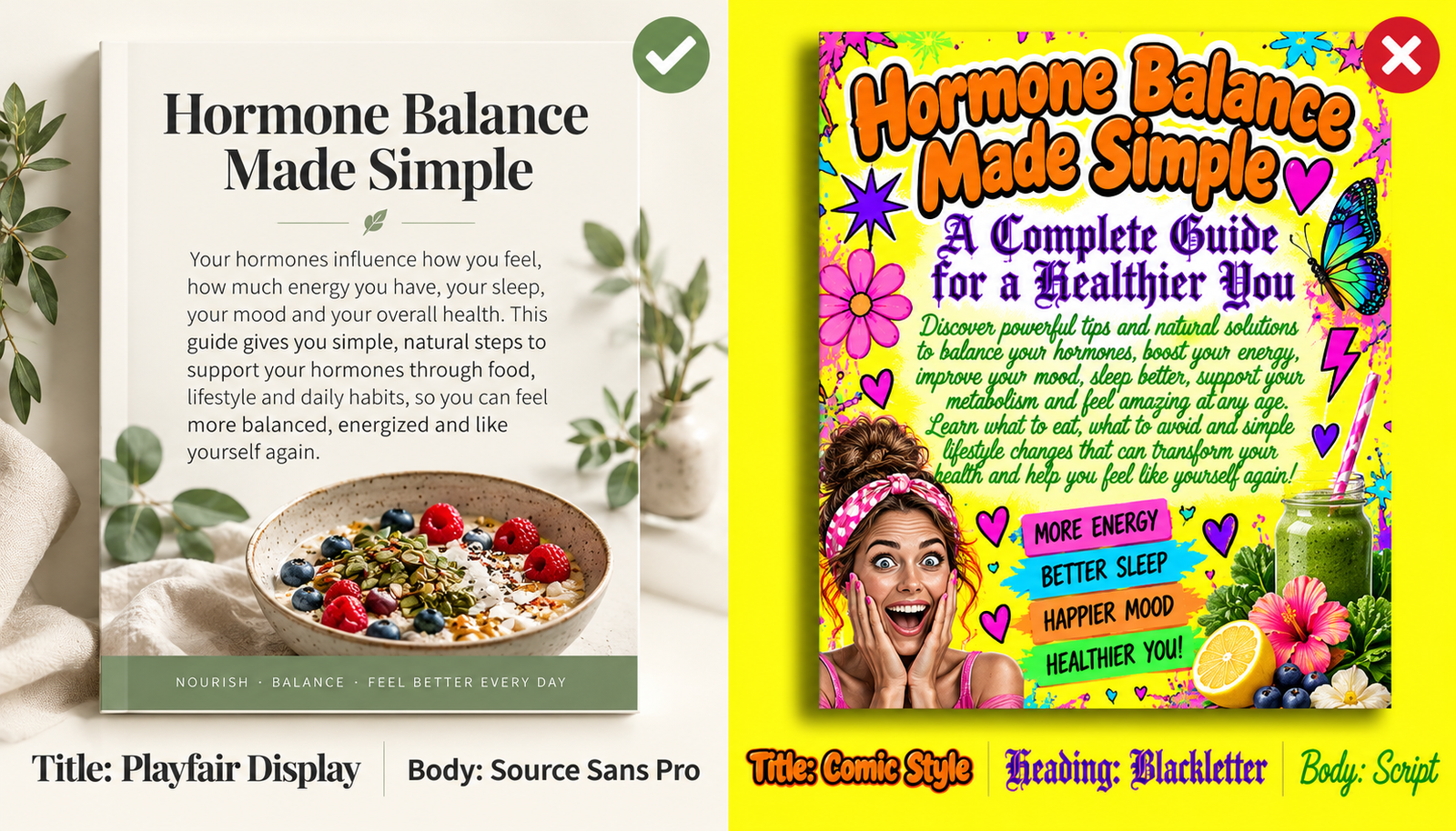
Example: Picture two versions of the same 30-day smoothie challenge. Version one uses a bubbly cartoon font for the title, a curly script for the headings and a narrow typewriter font for the recipes. Version two uses one bold, clean title font and a simple, open body font. The recipes are identical, yet most buyers will assume version two is the better product.
Think Like a Designer: Personality and Purpose
A designer never asks only “Do I like this font?” They ask what the font says and whether it suits the job.
Every font has a personality. Some feel calm and trustworthy, others fun, elegant, bold or old-fashioned. That personality sets the mood of your product the moment someone sees it.
Every font has a personality. Some feel calm and trustworthy, others fun, elegant, bold or old-fashioned. That personality sets the mood of your product the moment someone sees it. A heavy, blocky font can make a fitness plan feel energetic, while a delicate serif can make a skincare guide feel luxurious. On a website, the headline font often forms a visitor’s first impression of your brand in under a second. When the font’s personality matches your message, readers trust what they see before they read a single line.
One Title, Three Moods
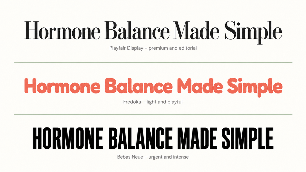
Type the title “Hormone Balance Made Simple” three times. In a thin, high-contrast serif such as Playfair Display, it feels premium and editorial. In a rounded font such as Fredoka, it feels light and approachable, almost like a kids’ book. In a heavy condensed font such as Bebas Neue, it feels urgent, like a bootcamp. Same words, three completely different promises.
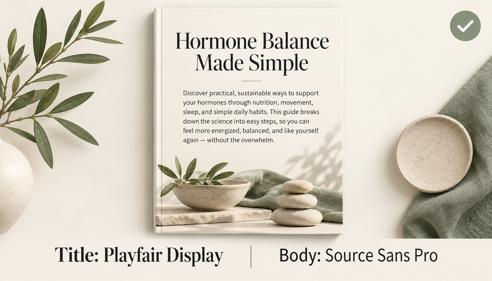
Your font should match the promise your product actually makes. For this title, Playfair Display is the best fit. Women seeking hormone help want expert, trustworthy guidance, and its refined serif signals authority without feeling cold. Paired with a clean sans serif such as Source Sans Pro for the body text, it still delivers on the “made simple” part of the promise.
Your font should match the promise your product actually makes. For this title, Playfair Display is the best fit. Women seeking hormone help want expert, trustworthy guidance, and its refined serif signals authority without feeling cold. Paired with a clean sans serif such as Source Sans Pro for the body text, it still delivers on the “made simple” part of the promise.
There are two reliable ways to build Canva font pairings, and both work.
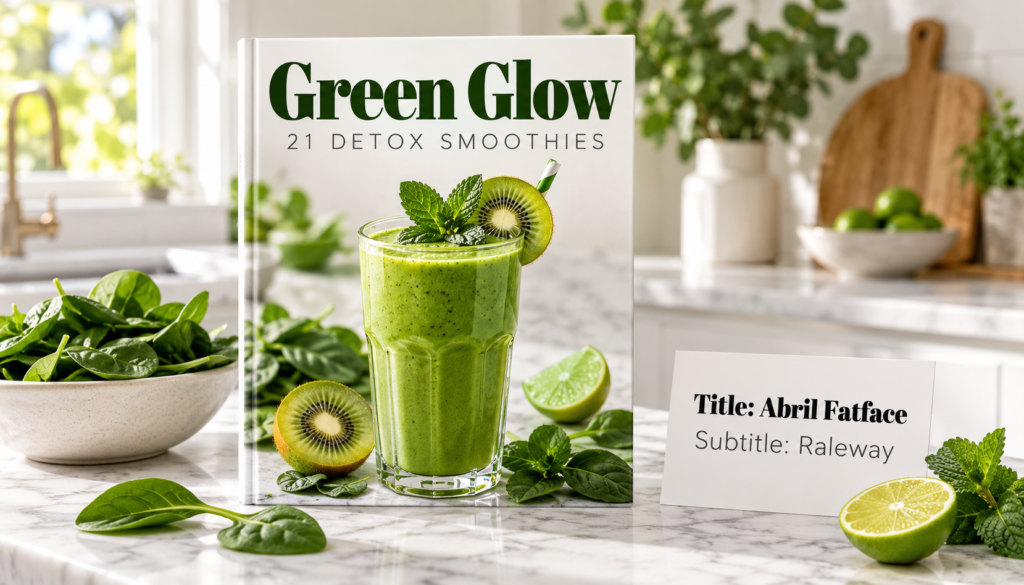
1. Contrast means choosing fonts that are clearly different, such as a bold display font with a plain sans serif. The difference tells the reader at a glance which text matters most. The danger zone is fonts that are almost the same but not quite. That looks like a mistake rather than a choice.
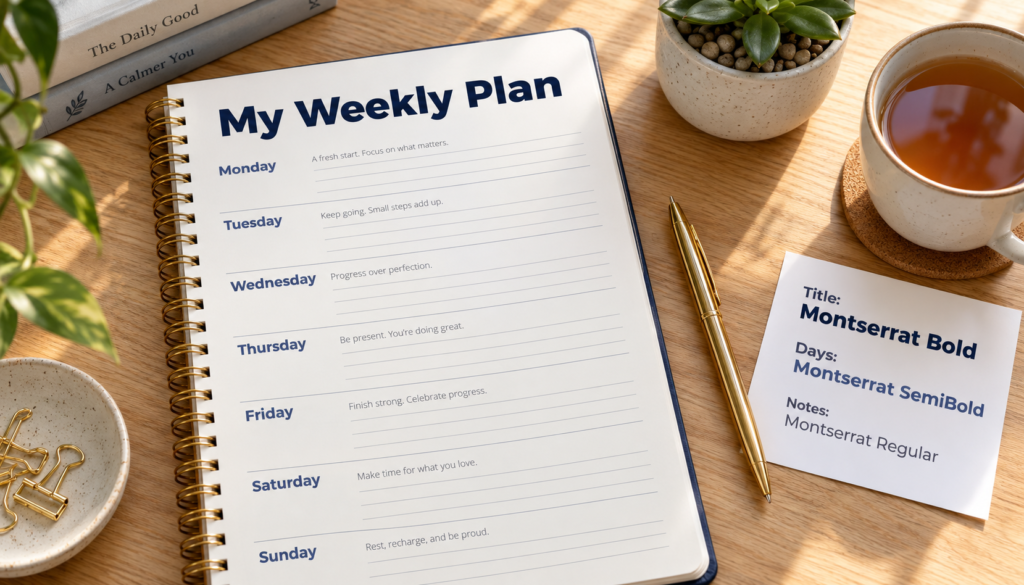
2. Harmony means choosing fonts that share traits, such as similar shapes or proportions. The simplest version is one font family in several weights: bold for titles, semibold for subheadings and regular for body text. The result is clean and coordinated.
Contrast example: Picture a smoothie recipe ebook cover. The title “Green Glow” is set in Abril Fatface, a chunky display serif with heavy strokes and rounded ends, in deep forest green. Directly below, the subtitle “21 Detox Smoothies” is set in Raleway, a light, thin sans serif with wide spacing. The two fonts could hardly be more different, and that is exactly why they work. The heavy title grabs the eye from across a crowded sales page, while the airy subtitle explains the offer quietly without fighting for attention. Each font has one job, and the reader instantly knows which to read first.
Harmony example: Picture a weekly planner set entirely in Montserrat. The title “My Weekly Plan” sits at the top in Montserrat Bold at 36 pt, in deep navy. Each day of the week is labeled in Montserrat SemiBold at 18 pt, in slate blue. The notes beside each day are written in Montserrat Regular at 11 pt, in soft gray. Only one font family is used, yet nothing blends together, because the change in weight, size and color does all the work. The result feels calm, organized and coordinated, and the reader moves from title to day to note without a second thought.
Contrast
Harmony

Mismatch example: Picture a sales page with headings set in Arial and body text set in Helvetica. At a glance they look identical, but small differences in letters such as “R,” “G” and “t” don’t quite line up. Readers rarely spot the cause, yet the page feels slightly off, as if something went wrong in the design. Two fonts this similar don’t create contrast, and they aren’t a true match either. The fix is simple: swap one for a clearly different style, such as a serif like Merriweather, or use just one of the fonts in two weights.
Typography is what language looks like
Ellen Lupton
There are two reliable ways to pair fonts, and both work for two different reasons
Font Styles to Know Before Choosing Canva Font Pairings
Knowing the main font styles helps you spot good partners quickly. A font often fits more than one style, for example a serif that is also elegant.
| Style | What it looks like | Mood it creates | Best use |
|---|---|---|---|
| Serif | Small strokes at the ends of letters | Traditional, trustworthy, editorial | Body text, book-style titles |
| Sans serif | Clean letters with no end strokes | Modern, simple, friendly | Body text, instructions, headings |
| Script | Flowing, joined pen or brush lettering | Elegant, romantic | Short titles and accents only |
| Handwritten | Loose marker or pen style | Personal, casual, playful | Short phrases and notes |
| Display | Bold, decorative or themed | Attention-grabbing | Covers, titles, posters |
| Modern and minimal | Clean lines, generous spacing | Polished, uncluttered | Headings and clean layouts |
| Retro and vintage | Details borrowed from past decades | Nostalgic, fun | Themed titles |
| Elegant and luxury | Fine lines, graceful curves, wide spacing | Refined, exclusive | Premium product titles |
| Playful and rounded | Soft edges, bouncy shapes | Friendly, lighthearted | Kids’ and casual products |
| Geometric | Built from circles and straight lines | Orderly, contemporary | Headings, branding |
| Condensed | Tall, narrow letters | Strong, space-saving | Long headlines in tight spaces |
| Typewriter and rustic | Uneven, aged or hand-painted texture | Vintage, handmade | Small accents |
The more personality a font has, the quieter its partner should be.


Train Your Eye: How to Spot Font Styles in the Wild
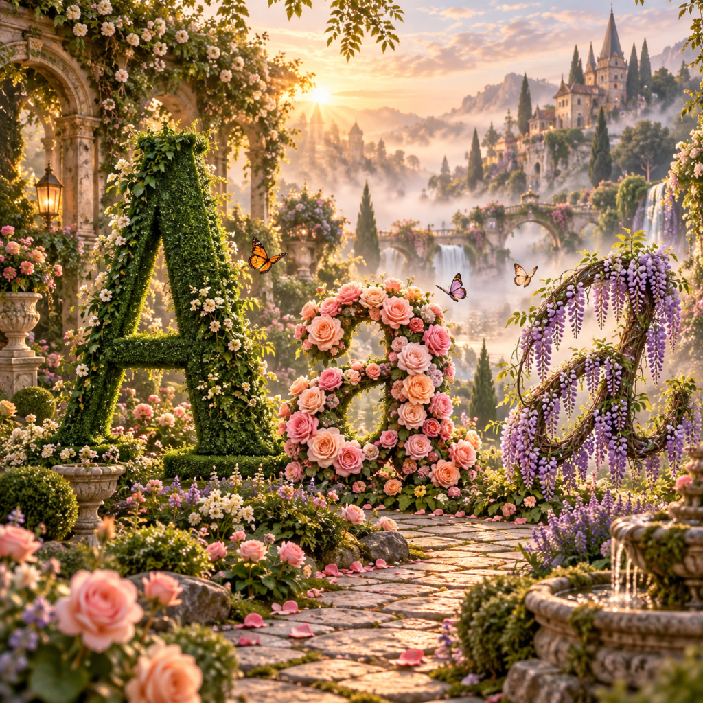
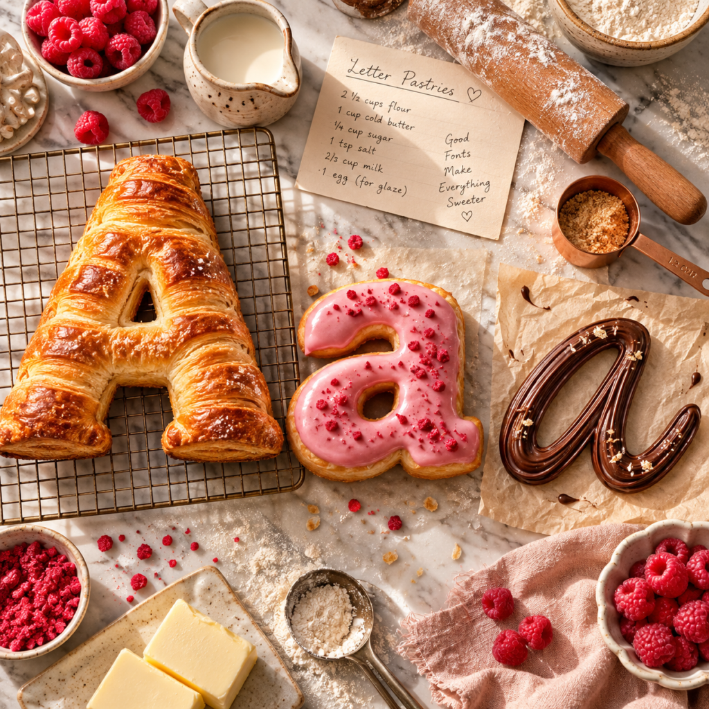
Next time you browse Etsy or a bestseller list, name the style of each cover title. A luxury skincare guide will lean on fine serifs and wide spacing. Fitness challenges tend to use condensed or geometric bold. Gratitude journals often pair a script accent with a soft serif. Ten minutes of this trains your eye faster than any rule.


Have you told your card companies that you are traveling?
Neque laoreet suspendisse interdum consectetur libero id faucibus. Massa sed elementum tempus egestas sed sed risus pretium. In nulla posuere sollicitudin aliquam ultrices sagittis orci. Aliquam vestibulum morbi blandit cursus risus. Scelerisque eu ultrices vitae auctor eu augue ut lectus.

Give Every Font a Role
Designers call this visual hierarchy. It is simply the order in which the reader’s eye moves: title first, then headings, then body text. Each font, size and weight you use should have one clear job in that order.
Readability always beats decoration. A script or handwritten font is lovely on a cover or a short quote. Spread across a 40-page workbook, it tires the eyes fast. Keep the decorative font for small moments and let a plain serif or sans serif carry everything else.
Test with your real words at the real size. Canva font pairings that shine in a large preview can fall apart on a phone screen or in small printable text.
Notice the script font appears once per section. That restraint is what makes it feel special.
| Level | Font | Size | Job |
|---|---|---|---|
| Cover title | Playfair Display Bold | 48 pt | Sets the mood and grabs attention |
| Section heading | Playfair Display Regular | 24 pt | Marks each new chapter |
| Subheading | Source Sans Pro SemiBold | 14 pt | Labels exercises and prompts |
| Body text | Source Sans Pro Regular | 11 pt | Instructions and explanations |
| Accent | Pacifico | 18 pt | One quote per section, no more |
A Five-Step Method for Canva Font Combinations
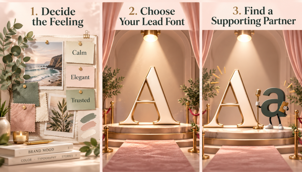
- Decide the feeling first. Before opening the font menu, pick two or three words for the mood: calm, bold, elegant, cheerful. Rule out any font that doesn’t fit.
- Choose your lead font. This is the one with the most character, used for the title. Everything else is chosen around it.
- Find a supporting partner. The second font is the quiet helper, not a second star. If the lead is decorative, the partner should be simple and highly readable.
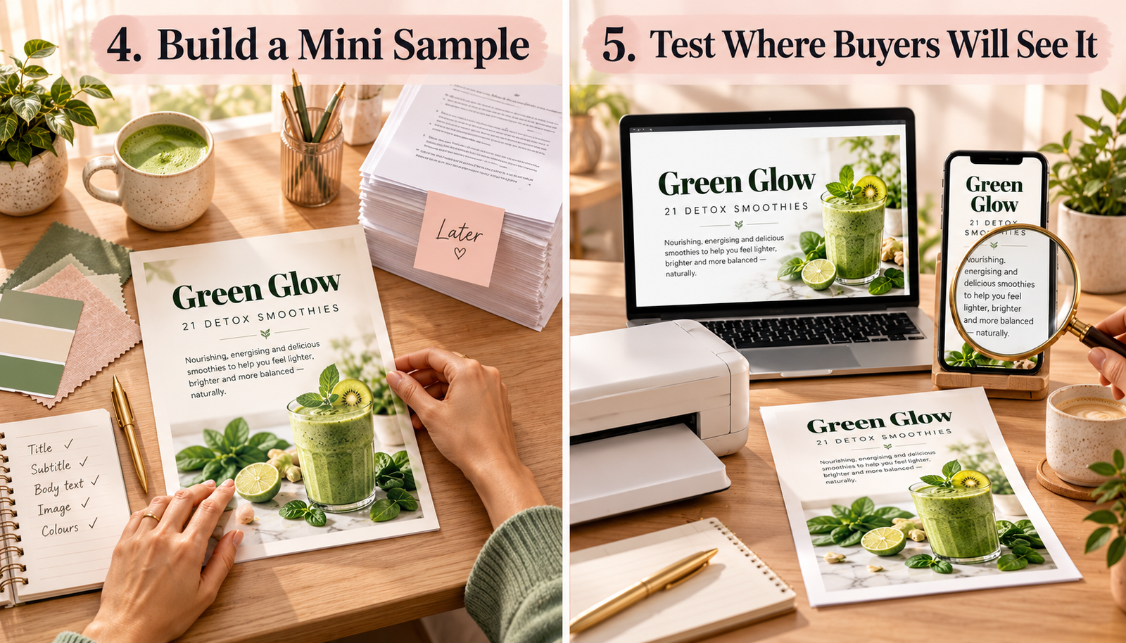
- Build a mini sample. Set a title, a subheading and a short paragraph before formatting the whole product. Fixing a sample takes minutes; fixing a finished ebook takes hours.
- Test where buyers will see it. Check it on a laptop and a phone, and print a page if the product is printable. Look hardest at the smallest text.
A Worked Example
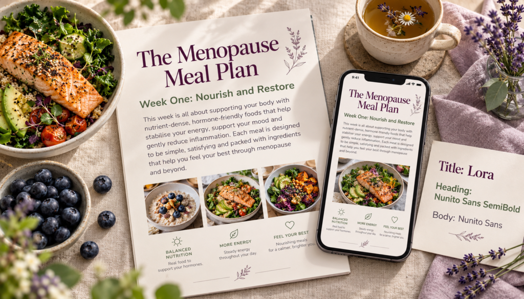
Step 1: First, the feeling is calm, supportive and expert. Lora is chosen as the lead font because its gentle curves feel warm but credible. For the partner, Nunito Sans wins because it is plain, rounded and easy on the eyes. A sample page then shows the Lora title at 32 pt, a Nunito Sans SemiBold heading at 16 pt and a short paragraph at 11 pt. On a phone the 11 pt text feels tight, so line spacing goes from 1.2 to 1.5. The pairing is locked in before a single meal plan is formatted. Step 2: Lora is chosen as the lead font because its gentle curves feel warm but credible. Step 3: Nunito Sans is chosen as the partner because it is plain, rounded and easy on the eyes. Step 4: a sample page shows the Lora title at 32 pt, a Nunito Sans SemiBold heading at 16 pt and a short paragraph at 11 pt. Step 5: on a phone the 11 pt text feels tight, so line spacing goes from 1.2 to 1.5. The pairing is locked in before a single meal plan is formatted.
Five Mistakes to Avoid in Font Pairings
- Too many fonts. Two families are usually plenty, and the best Canva font pairings rarely need a third. Before adding one, try changing the size, weight, capitals or spacing of a font you already have.
- Fonts that are nearly twins. Two very similar sans serifs look accidental. For a subtle look, use different weights of one family instead.
- Everything decorative. A script title, handwritten subheads and playful body text all fight for attention. Give the eye somewhere plain to rest.
- Ignoring weight and spacing. A hairline title can vanish beside heavy body text, and tight letter spacing looks cramped next to an airy font. Small adjustments often fix a pairing without swapping fonts.
- Judging by sample text. Type your real title, prices, numbers and instructions. Some fonts look odd in all caps or with long words.
Before and After: How One Font Fix Saved a Reel Pack

A juicing reel pack originally used Great Vibes for the hook text, Amatic SC for the ingredient list and Comic Neue for the method. On a phone, the ingredients were almost unreadable. The fix kept Great Vibes only for the two-word hook, moved everything else to Poppins in two weights, and increased letter spacing slightly. Same colors, same photos, but the cards now read in one glance.
Canva Font Pairings to Try
These combinations follow the principles above. Use them as they are or as a starting point.
| Title font | Body font | Why it works | Good for |
|---|---|---|---|
| Playfair Display | Source Sans Pro | Elegant high-contrast serif with a calm, clean sans serif | Wellness ebooks, premium guides |
| Montserrat Bold | Merriweather | Strong geometric sans serif over a warm, readable serif | Authority articles, reports |
| Bebas Neue | Open Sans | Tall condensed headline with friendly, easy body text | Challenges, social graphics |
| Pacifico | Lato | Cheerful script accent kept in check by a neutral sans serif | Recipe cards, lifestyle printables |
| Abril Fatface | Raleway | Dramatic display serif with a light, modern partner | Covers, sales page headers |
| Cinzel | Lora | Classical carved capitals with a gentle serif | Spiritual and heritage products |
| League Spartan | Libre Baskerville | Bold modern title softened by a bookish serif | Workbooks, courses |
| Fredoka | Nunito | Two rounded fonts in harmony, one bold and one quiet | Kids’ and family products |
| Special Elite | Roboto | Typewriter texture as an accent over clean body text | Journals, vintage themes |
| Poppins (Bold, Medium, Regular) | Poppins | One family, three weights for a tidy hierarchy | Planners, checklists |
How to Find and Use Canva Font Pairings
Canva makes it easy to experiment, even if you have never chosen fonts before. Open any design, click the Text tab on the left, and you’ll see a grid of ready-made font combinations. Each preset gives you a heading and a subheading that already work together, so it is a quick way to spot Canva font pairings you like. Type a font name into the search box above the grid, such as Playfair Display, and Canva shows you every preset that uses it.
Treat these presets as a starting point, not the finished design. A preset usually covers only the heading and subheading, so you still need to choose a body font for your paragraphs, instructions and recipe steps. Apply the same rules from this guide: keep one font with personality, give it a quiet partner, and check that both match the mood of your product.
Once you find Canva font combinations that suit your brand, save them so you never have to hunt for them again. On a paid Canva plan, the Brand Kit lets you set default fonts for your headings, subheadings and body text. Every new ebook cover, reel card, workbook page or website graphic then starts with the same fonts, which keeps your whole product line looking consistent and professional.
Before you lock in any Canva font pairings, test them the way your buyers will see them. Download a page as a PDF and open it on your phone. Preview your reel cards at full phone size. View your website graphics on a laptop and a mobile screen. Canva fonts that go well together on a large screen can feel cramped at small sizes, so a quick check now saves you from reformatting a finished product later.
Matched Font Pairings to real products
- Authority article series: Montserrat Bold with Merriweather. The sans serif headlines feel current, while the serif body text reads like a respected publication and supports long reading.
- Social media reel pack: Bebas Neue with Open Sans. Condensed headlines fit big words into narrow vertical frames, and Open Sans stays sharp at small sizes on phones.
- Spiritual or heritage reading document: Cinzel with Lora. Cinzel’s carved capitals suggest tradition and ceremony, while Lora keeps several pages of text comfortable to read.
- Recipe cards for printables: Pacifico for the recipe name only, Lato for ingredients and steps. The script adds personality; the sans serif keeps quantities clear in a busy kitchen.
- Digital marketing challenge workbook: League Spartan with Libre Baskerville. Bold, energetic headings motivate, and the serif body gives the lessons weight and credibility.
Do You Need to Buy Fonts?
For most digital product creators, no. Every one of the Canva font pairings in this article is available free, and many of the best fonts in the world cost nothing to use commercially
Paid fonts make sense when you want a distinctive brand look that nobody else in your niche is using. A unique title font can make your covers, sales pages and website instantly recognizable. Before you buy, check exactly what the license covers. Many paid fonts sell separate licenses for desktop use, websites, ebooks and apps, so a basic desktop license may not cover your sales page or a PDF you sell. Popular places to buy fonts include MyFonts (https://www.myfonts.com), Fontspring (https://www.fontspring.com) and Creative Market (https://creativemarket.com). If you create a lot of products, a subscription can work out cheaper: Envato Elements (https://elements.envato.com) includes thousands of fonts with a commercial license, and Adobe Fonts (https://fonts.adobe.com) comes with an Adobe Creative Cloud plan. Whichever you choose, save a copy of the license with your product files in case you ever need to prove you can use the font.
Rules Are a Starting Point
These principles give you a safe foundation, not a cage. An unexpected pairing can still work if the moods match, each font has a clear job and every word stays easy to read.
The real shift is choosing fonts on purpose instead of picking ones you happen to like. Do that, and your digital products will look like a designer made them.
Fonts are one of the quickest ways to lift the look of everything you create, from ebooks and reel packs to sales pages and websites, and you don’t need a design degree to get them right. Start with the feeling you want, let one font with personality lead, give it a calm, readable partner, and test the pairing wherever your buyers will see it. As designer Ellen Lupton put it, “Typography is what language looks like.” When your fonts work together, your words look as trustworthy and professional as they deserve to.